-
-
ha ha haComment
-
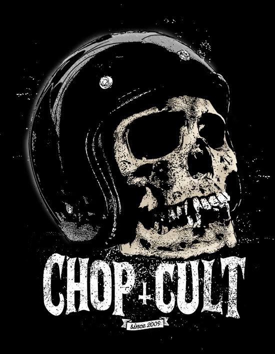
yeah, that skull T design is nicely done,.Comment
-
That's cool to say .... I seem to hate everything I do and am always admiring everyone else's stuff. Guess that's just part of being a designer though.Comment
-
Here are a couple more...


Comment
-
The "33" thing has been on almost all the t-shirts and merch by Church Of Choppers for a few years now.
Just sayin'Comment
-
This more to your liking Mike?

I'll take one of MiniDanzigs though, that design pretty much rules.Comment
-
How about one with the Jockey Journal logo with a big VOID stamp across it and the Chop Cult logo under it?Comment
-

-----------------------------------------

Comment
-
anything thats dark is great so when people see it and come on and see pink ponies and rainbows and unicorns everywhere they will shit themselvesComment

 Tweet
Tweet


 exactly


Comment